how it Works
Our Art Visualizer applies the concepts of the dynamics of rotational motion and Fourier Transforms, combining them with powerful MATLAB tools to compute and visualize the physical movements of artists as they perform art in 3D space. A smartphone with accelerometer and gyroscope data is all that’s required to capture the motion of artists, from fire spinners to painters and dancers. In our experiments, we mounted the phone in the positions that could capture the most visually noticeable movements of the artists: one on the staff of the fire spinners, and the other on the dancer’s wrist.
After we collected the data, we uploaded it to MATLAB, and used rotating reference frames and integration of acceleration to create position vectors for the movement of the phone in global space. We then analyzed the frequencies at each point with a +/- 50 span of data points, split the frequency changes into intervals, assigned each frequency a color from lowest to highest, and created a color gradient vector to illustrate transitions from one frequency to the next, and the phone accelerated and decelerated.


Figure 1: The phone’s coordinate system using MATLAB Mobile. (Image via ClipartXtras)
acquiring data
In our experiment, we used MATLAB Mobile to gather the accelerometer and orientation data from the phone. The coordinate system of the collected data is shown in Figure 1.
Rotating reference frame
Because the accelerometer data was collected with respect to the phone frame, we needed to apply 3D rotation matrices to transform the accelerometer data to the global frame. To keep this simple, we just used the initial position of the phone at orientation [yaw, pitch, roll] = [0, 0,0] determined by the phone as the origin of our global frame.

Equation 1: Rotation matrices.
Subtracting the gravity vector
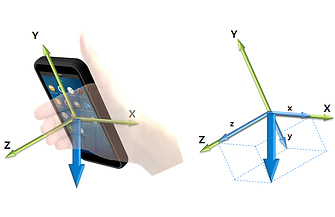
Figure 2: Gravity sensor vector and axes.
(Image via Tizen Developer)
The acceleration vectors recorded by the MATLAB mobile include an arbitrary gravity vector that is unstable at each recording timestep. In the beginning, we tried subtracting the average of the gravity vectors over time from the acceleration data to get rid of gravity. That is, when collecting the data, we would leave the phone stable on a flat surface for a few seconds, and the data collected in these few seconds would be used to calculate the average gravity vector. However, the result didn’t look good for two reasons:
Contributors to Error
1st
2nd
3rd
We didn’t take into account the accumulation of errors over time in both the accelerometer and orientation data. According to this article, an angle error of even one degree will push the estimated velocity off by 1.7 m/s and the position off by 17.1 meters after 10 seconds.
Phone sensors cannot detect orientation and acceleration perfectly. For example, the gravity vector was so unstable that it was difficult to find a uniform, average gravity vector that could work for the full-length data set.
The Matlab app uses magnetic fields to obtain orientation data, so the phone's orientation sensing can be arbitrary around motors and electrical grids.
To tackle the gravity acceleration issue, we took advantage of the fact that the phone’s final position would be very close to its initial position. Therefore, the sum of all acceleration vectors would be very close to zero (or to the gravity vector if we take into account the additional gravity component). As a result, if we find the mean of the acceleration vectors and subtract it from the data set, we can both eliminate the gravity vector and reduce the effect of drifting.
The results can be seen in Figure 3 below. On the right plot, the mean method significantly reduces the effect of drifting along the Z-axis, which is affected mostly by gravity, and along the X-axis.
Equation 2: Subtract the mean from the acceleration data to eliminate gravity and reduce the drifting effect.

Figure 3: The left figure shows the "Figure 8" motion obtained from acceleration data subtracted by the average gravity. The right figure shows the method of subtracting the mean acceleration. The method used on the right produces better results than the one on the left as it both subtracts the gravity vector and weakens the drifting effect.
However, we were still unable to find a proper way to reduce the drifting error in the orientation data because the angle values are periodic from -180 to +180 degrees. As a result, there is still a dramatic drifting effect along one or two axes in some cases.
Figure 4 on the right shows an example of the drifting effect using the mean-subtracting method.

Figure 4: The "Figure 8" trail obtained from the acceleration data using the mean-subtracting method.
Obtaining position vectors
After getting the acceleration vectors in the global frame, we can easily obtain the position vectors by integrating the acceleration vectors over time to get the velocity vectors, and then integrating the velocity vectors to obtain the position vectors (Equation 3).

Equation 3: Double integration to obtain position vectors.
Determining the frequency at each timestep

Figure 5: Acceleration Magnitude over time on top, frequency plot of a 100-point sample on the bottom.
In order to have our motion animation change color at different frequencies in our global acceleration data, we found the magnitude of the acceleration and calculated the primary frequencies of 100-point intervals centered around each point. With this method, we had to cut the first and last 50 points, but during the recordings, we started and ended with the phone flat on a table, so we didn’t lose any motion data.
With a list of all the unique frequencies present in the motion data, we were able to map those frequencies to a list of colors, from lowest to highest, so that our color scale can reflect increase and decreasing frequencies. Since frequency values often rise and fall, we then had to split the data into intervals for how long each frequency was maintained, and then match the colors to the frequency values.
In order to smooth the transitions between colors, we created a color gradient for each interval, by using the MATLAB ‘linspace’ function to make a gradient from one color to the next for a given number of data points. The end result was a vector with an RGB color value for each data point, to illustrate the rate and direction of frequency changes.
Plotting the results in MATLAB
We animated the results using MATLAB 3D plot function and recorded a screen video of it. Click here to watch the video.

Figure 6: Visualizing "Figure 8" using MATLAB plot.